Medication Label Readability Checker
Check Your Label's Readability
Enter your prescription label details to see if it meets FDA readability standards for safety.
Every time you pick up a prescription, there’s a small piece of paper stuck to the bottle that could save your life. It’s not just a reminder to take your medicine - it’s a safety map. But if the text is too small, the warnings are buried, or the symbols don’t make sense, that map becomes useless. That’s why pharmacy labels and warning stickers are changing - and why you need to know how to read them now.
What’s Actually on Your Prescription Label?
Your prescription label isn’t just a name and dosage. Federal law requires it to include your name, the drug’s name, the strength, how much to take, how often, and the prescriber’s name. But that’s the bare minimum. What’s missing? Clear warnings. Clear instructions. Clear contrast.
Right now, labels vary wildly. One pharmacy might print your instructions in 5-point font. Another might use a serif font that’s hard to read. Some use yellow warning stickers that blend into the bottle. Others use bright orange - like in Connecticut, where state law now requires a 1.25-inch fluorescent orange circle on all opioid prescriptions. That’s not random. It’s designed to catch your eye.
The FDA is pushing for a new standard called Patient Medication Information (PMI). By January 1, 2025, every prescription in the U.S. should follow a single, clear format. No more guessing. No more mixing up pills because two labels look too similar. The PMI will put the most important info - what the drug does, what to watch out for, and what to do if something goes wrong - front and center, in plain language.
Why Font Size and Color Matter More Than You Think
Think about the last time you read a label under dim kitchen light. Now imagine you’re 72, have arthritis in your hands, and take eight different pills. That’s the reality for 68% of adults over 65, according to AARP’s 2023 survey. They can’t read the tiny print.
The FDA’s new rules demand a minimum 6-point font for basic info and 8-point or larger for warnings. No more 4-point fonts. No more gray text on white background. Labels must have high contrast - black on white, or white on bright orange. Sans-serif fonts like Arial or Helvetica are required because they’re easier to read.
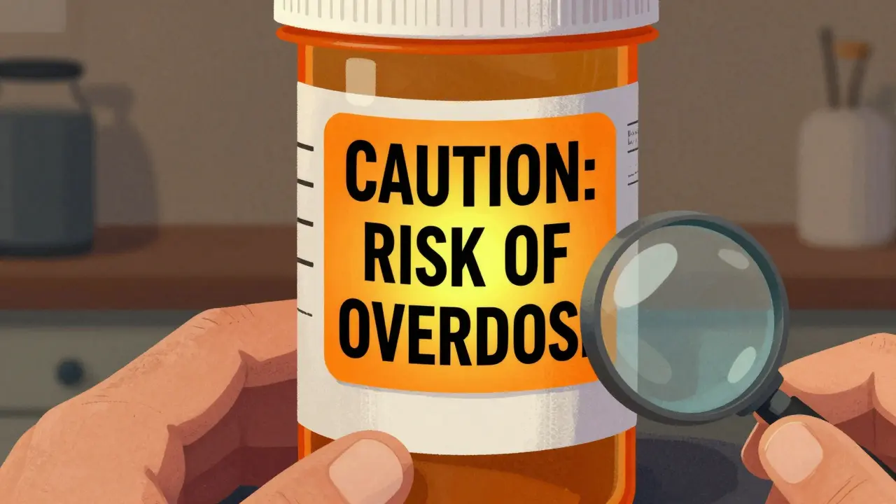
Color isn’t just about looks. It’s a signal. Fluorescent orange means “danger” - and it’s now mandatory for opioids in Connecticut and 26 other states. Red with white text is used for high-risk warnings like “Risk of Overdose.” These aren’t decorative. They’re part of a visual language designed to be understood even if you can’t read well.
Barcodes and QR Codes: More Than Just Tech
Every prescription label now has a barcode - usually a GS1 DataMatrix or Code 128. That’s not just for the pharmacy’s scanner. It holds your National Drug Code (NDC), lot number, and expiration date. Pharmacists scan it to make sure you’re getting the right drug, the right dose, and that it hasn’t expired.
Some newer labels include QR codes. Scan one with your phone, and you might get a video showing how to take the pill, or a printable sheet with side effects in your language. In California, 32% of prescriptions now come with Spanish or Chinese translations printed right on the label. In 18% of cases, QR codes link to video instructions. These aren’t gimmicks. They’re solving real problems.
A 2021 California survey found 47% of patients with limited English proficiency couldn’t understand standard labels. Now, with multilingual labels and video guides, that number is dropping. It’s not just about being nice - it’s about preventing errors. The Institute for Safe Medication Practices reports that 12% of medication errors in pharmacies are tied to poor label readability.
Warning Stickers: What the Colors and Words Really Mean
Not all warning stickers are the same. Here’s what to look for:
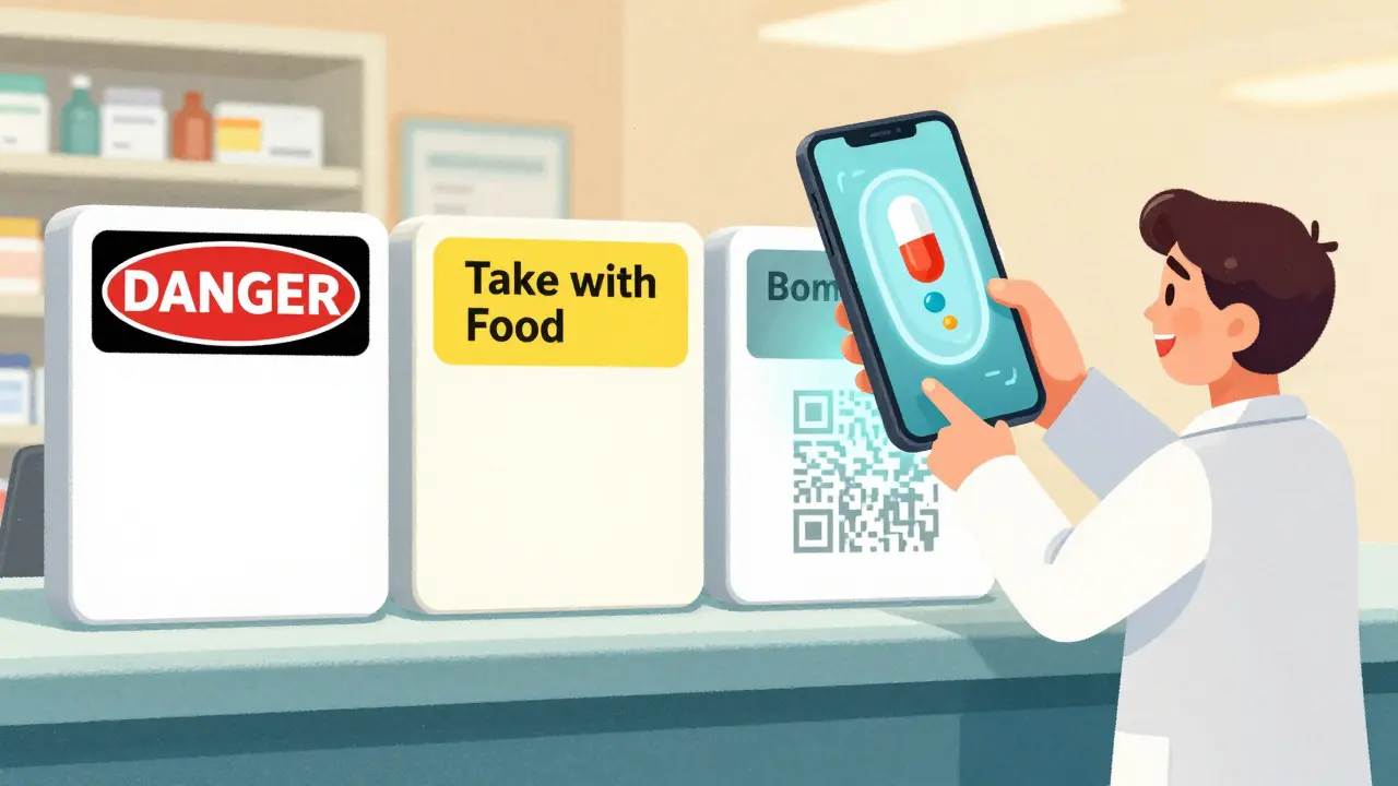
- Fluorescent orange circle - Mandatory in Connecticut and 26 other states. Means this is a controlled substance, often an opioid. High risk of addiction or overdose.
- Red with white text - Usually means “CAUTION: Risk of Overdose” or “Do Not Mix with Alcohol.” This is the highest level of warning.
- Yellow - Often used for general advice like “Take with food” or “May cause drowsiness.” Not as urgent, but still important.
- Blue or green - Rare, but sometimes used for reminders like “Refill available” or “Follow-up appointment needed.”
These aren’t arbitrary. The colors follow industry standards developed by the USP (United States Pharmacopeial Convention) and are being adopted nationwide. A red sticker isn’t just scary - it’s a signal that you need to talk to your doctor before taking another pill.
What’s Changing in 2025 - And Why You Should Care
By early 2025, every pharmacy in the U.S. must switch to the FDA’s new Patient Medication Information (PMI) format. That means:
- A single, standardized page for each drug - no more guessing what info is important.
- Clear headings: “What this medicine is for,” “How to take it,” “What to watch out for,” “What to do if you miss a dose,” “When to call your doctor.”
- No jargon. No Latin terms. No fine print.
- Warnings are grouped by severity - life-threatening risks come first.
This change affects 5.8 billion prescriptions a year. That’s every pill you, your parents, your kids, and your neighbors take. The goal? Reduce medication errors by up to 30%, according to Dr. Lucinda Maine of the American Association of Colleges of Pharmacy.
Small pharmacies may struggle with the cost - upgrades for scanners, software, and training can run $5,000 to $15,000. But the payoff is safety. The National Academy of Medicine calls standardized labeling one of the “highest-impact, lowest-cost” ways to prevent errors.

How to Protect Yourself Right Now
You don’t have to wait for 2025 to stay safe. Here’s what to do today:
- Read every label - even if you’ve taken the drug before. Doses change. Warnings get updated.
- Check the font and contrast. If you can’t read it without squinting, ask for a larger print version. Pharmacies are required to provide this.
- Ask about color codes. “What does this orange sticker mean?” “Why is this one red?”
- Use your phone. Scan QR codes. Watch the videos. They’re there to help.
- Keep a list. Write down every medication you take - name, dose, time, reason. Bring it to every appointment.
- Don’t assume. If two pills look similar, ask the pharmacist to confirm. You’d be surprised how often people mix up blood pressure and diabetes meds because the labels looked alike.
One pharmacist on Reddit said she had three patients in one week confuse their meds because the labels were too similar. That’s preventable. You don’t need to be a doctor to spot a problem. You just need to look closely - and ask questions.
What’s Next for Prescription Labels?
The future is already here. By 2027, experts predict 75% of labels will include augmented reality features. Point your phone at the bottle, and a 3D animation shows you how the drug works in your body. Voice-enabled labels are being tested - just say, “What does this pill do?” and your phone answers.
But none of that matters if the basics aren’t right. The real win isn’t flashy tech. It’s a label you can read in five seconds - even if you’re tired, stressed, or blind in one eye.
The goal is simple: no more guessing. No more silent mistakes. Just clear, honest, easy-to-understand information - right on the bottle.
Why do some pharmacy labels have orange stickers and others don’t?
Orange stickers are required by state law in 27 states, including Connecticut, for prescriptions containing opioids or other controlled substances. They’re not a federal requirement yet, but the FDA’s new Patient Medication Information (PMI) rule, set for 2025, will likely make similar visual warnings standard nationwide. If your label doesn’t have one, your state may not have passed the law - or the pharmacy may be out of compliance.
Can I ask my pharmacist for a larger print label?
Yes - and they’re legally required to provide it. Under the Americans with Disabilities Act (ADA), pharmacies must make reasonable accommodations for patients with vision impairments. Ask for a “large print” or “easy-read” version. Many pharmacies now offer this as a standard option, especially for older adults.
What should I do if I don’t understand a warning on my label?
Don’t guess. Call your pharmacist or doctor. If the warning says “may cause dizziness,” ask: “How bad is it? Should I avoid driving?” If it says “avoid alcohol,” ask: “Does that mean one beer is okay?” Most pharmacists are trained to explain these in plain language. You’re not being annoying - you’re being smart.
Are QR codes on prescription labels safe to scan?
Yes. QR codes on FDA-approved prescription labels link only to verified, secure websites - usually the drug manufacturer’s patient information page or your pharmacy’s portal. They don’t collect data or install software. They’re designed to give you clearer instructions, videos, or multilingual translations. Always check the URL before entering any info - but for standard pharmacy labels, they’re safe and helpful.
Why do some labels have barcodes and others don’t?
All prescription labels in the U.S. must have a barcode as of 2023. If yours doesn’t, it may be an older label, a compounding pharmacy’s hand-written label, or a labeling error. Call your pharmacy and ask them to reissue it with a proper GS1 DataMatrix barcode. Without it, the pharmacy can’t scan it for safety checks - which increases the risk of giving you the wrong drug.
Will the new FDA labels change how I get my refills?
No - your refill process won’t change. But the information on the label will. Instead of scattered details, you’ll get one clear page with all the key info: what the drug does, how to take it, risks, and what to do if you have side effects. You’ll still get the same pill, just with better instructions. It’s designed to make you safer - not slower.
sue spark
Finally someone wrote this the way it needs to be said. I used to skip reading labels until my grandma almost took two different blood pressure pills by accident. Now I check every single one. Even if it's the same drug. Even if it's from the same pharmacy. Small print kills.
Tiffany Machelski
i never knew the orange sticker meant opioid until last year. my dad got one and i thought it was just a sale tag lol. now i ask the pharmacist every time. thanks for this
SHAMSHEER SHAIKH
It is imperative to recognize that the standardization of pharmaceutical labeling is not merely a procedural adjustment, but a profound ethical imperative in public health. The United States Pharmacopeial Convention has established rigorous guidelines, and the FDA’s forthcoming Patient Medication Information initiative represents a monumental stride toward reducing iatrogenic harm. One must not underestimate the gravity of legibility, contrast, and typography in preventing medication errors - particularly among the geriatric population, who constitute the majority of polypharmacy patients.
Moreover, the integration of QR codes and multilingual resources is not an innovation; it is a moral obligation. In a nation as diverse as ours, linguistic accessibility is non-negotiable. The fact that 47% of patients with limited English proficiency previously could not comprehend their prescriptions is not just alarming - it is unacceptable.
Let us not wait for regulatory mandates to act. Every pharmacist, every caregiver, every family member must become an advocate for clarity. The cost of compliance is trivial compared to the cost of a single preventable overdose.
James Rayner
There’s something about holding a pill bottle and realizing you don’t know what’s inside… it makes you feel small. Like you’re trusting someone else’s handwriting with your life.
I scanned a QR code last week - it played a 90-second video of someone swallowing a pill with water. No music. No voiceover. Just the motion. And I cried. Not because it was sad. Because it was so simple. And so necessary.
Why do we make safety so complicated?
Souhardya Paul
I work at a small clinic and we’ve started printing large print labels for everyone over 60 - no questions asked. We don’t wait for them to ask. It’s easier, cheaper, and honestly - just the right thing to do.
Also, we put the QR code on the back of the bottle so it doesn’t peel off. Small tweak. Huge difference.
Josias Ariel Mahlangu
People these days are too lazy to read. If you can’t read a label, maybe you shouldn’t be taking pills. My grandfather took 12 medications a day and he read every one in tiny print. He didn’t need a QR code. He had eyes. He had discipline.
anthony epps
so the orange thing is for opioids? i thought it was just a sticker they put on everything. now i get why my cousin freaked out when she saw it on her anxiety med
Andrew Sychev
THIS IS WHY AMERICA IS FALLING APART. Pharmacies are giving out pills like candy and nobody cares. You think a bigger font is going to fix a system that treats people like inventory? Wake up. The real problem is that doctors are overprescribing and pharmacies are cashing in. The label is just a Band-Aid on a gunshot wound.
Dan Padgett
Back home in Nigeria, we used to write the name of the medicine on the bottle with a marker - sometimes in pencil. No labels at all. I remember my uncle taking a yellow pill thinking it was for malaria, but it was for high blood pressure. He ended up in the hospital.
So when I saw this post, I didn’t just nod. I bowed. Because this isn’t tech. This is survival.
Hadi Santoso
my dad’s from Indonesia and he still gets confused with meds here. last time he went to the pharmacy, they gave him a label with both english and indonesian. he cried. not because he was sick - because someone finally remembered people like him exist.
qr codes? yes please. i scanned one and it played a video in tagalog. i didn’t even know my mom took that pill.
Mike Smith
As a healthcare administrator with over two decades of experience in patient safety systems, I can unequivocally state that the FDA’s Patient Medication Information initiative represents one of the most impactful, cost-effective, and ethically sound reforms in modern American healthcare.
The adoption of standardized typography, mandatory high-contrast color schemes, and universally legible font sizes is not merely a regulatory update - it is a fundamental recommitment to the principle of informed consent. When patients cannot read their own prescriptions, their autonomy is compromised.
Furthermore, the integration of multilingual resources and digital aids such as QR-linked video instructions is not a luxury - it is a necessary evolution in an increasingly diverse and aging population. The data is clear: readability correlates directly with adherence and inversely with adverse events.
Pharmacies that resist this transition are not merely lagging technologically - they are endangering lives. The cost of implementation is dwarfed by the cost of preventable hospitalizations, emergency visits, and fatalities. This is not policy. This is public health responsibility.
Ron Williams
my mom just got her first QR code label last week. she doesn’t use her phone much but she watched the video on my tablet. said it made her feel less scared. just saying it out loud like that - it meant something.
Kitty Price
just scanned my insulin label - the video showed how to store it. i didn’t know it had to be refrigerated after opening. thank you for this. 🙏